
Data Visualization in R: From Data Wrangling to Interactive Plots
Dates
30 June – 2 July 2025
To foster international participation, this course will be held online
OVERVIEW
In this 3-day hands-on course, participants will learn how to create clear, elegant, and insightful data visualizations using R. The course takes a practical approach, beginning with data
wrangling and cleaning, and progressing through basic and advanced plotting techniques to interactive dashboards and reproducible reporting.
Whether you're new to data visualization or looking to refine your R plotting skills, this course will guide you through powerful tools from the tidyverse, ggplot2, plotly, and shiny.
Participants will leave with a set of reusable templates and scripts, plus the confidence to visualize complex datasets in meaningful ways.
No prior experience in R is strictly required, but a basic familiarity with R is helpful.
Prerequisites
This course is aimed at researchers and technical workers with a background in any data-related field. In general, no programming experience is needed. The course teaches all relevant steps to load, transform and visualize the data. However, basic knowledge of R is beneficial. If you like to learn R beforehand, We suggest you to attend our Introduction to R and the tidyverse course: https://www.physalia-courses.org/courses-workshops/r-tidyverse/
Learning Outcomes
By the end of the workshop, participants will be able to:
- Understand and apply core principles of effective data visualization, including appropriate use of colors, chart types, and layout.
- Import, clean, and transform data in R using the tidyverse suite of packages.
- Grasp the layered grammar of graphics in ggplot2 and how to build plots step by step.
- Create a variety of data visualizations to explore and communicate insights using ggplot2.
- Produce high-quality, publication-ready figures that are clear, visually appealing, and easy to interpret.
Program
All materials and code examples will be available on GitHub/GitLab.
Day 1 – Data Wrangling and Basic Plotting - 1-5 PM Berlin time
Importing datasets from CSV, Excel, and online repositories
Introduction to the tidyverse: dplyr, tidyr, readr, and tibble
Cleaning and transforming data for visualization
Creating basic plots using ggplot2: scatterplots, barplots, boxplots, and line plots
Mapping variables to aesthetics: color, shape, size
Saving and exporting plots
Day 2 – Advanced and Aesthetic Visualizations - 1-5 PM Berlin time
Multi-panel and faceted plots (facet_wrap, facet_grid)
Complex plots: heatmaps, PCA biplots, violin plots, Manhattan plots, oncoplots
Fine-tuning plots: custom themes, color palettes, fonts, and labels
Using extensions and custom geoms to enhance data storytelling
Combining multiple plots (patchwork, cowplot)
Day 3 – Interactive Visualizations and Reporting- 1-5 PM Berlin time
Intro to interactivity with plotly and ggplotly
Interactive dashboards with shiny: linking inputs and outputs
Embedding plots in R Markdown and HTML reports
Dynamic visualizations for web sharing
Best practices for reproducibility and version control
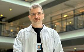
Instructor
Ehsan is a postdoctoral researcher in cancer bioinformatics at the University of Helsinki, with a background in computational biology, data science, and statistical modeling. He has extensive experience designing interactive data applications using R and Shiny, and specializes in turning complex biological datasets into meaningful visual stories. Ehsan is also an advocate for open science and reproducible research, and actively develops open-source tools to support the scientific community.
Cost overview
Cancellation Policy:
> 30 days before the start date = 30% cancellation fee
< 30 days before the start date= No Refund.
Physalia-courses cannot be held responsible for any travel fees, accommodation or other expenses incurred to you as a result of the cancellation.